9 minutes read
Anaconda Installation
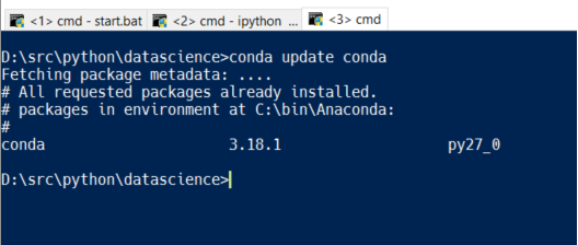
To do some serious statistics with Python one should use a proper distribution like the one provided by Continuum Analytics. Of course, a manual installation of all the needed packages (Pandas, NumPy, Matplotlib etc.) is possible but beware the complexities and convoluted package dependencies. In this article we’ll use the Anaconda Distribution. The installation under Windows is straightforward but avoid the usage of multiple Python installations (for example, Python3 and Python2 in parallel). It’s best to let Anaconda’s Python binary be your standard Python interpreter. Also, after the installation you should run these commands:
conda update conda
conda update
“conda” is the package manager of Anaconda and takes care of downloading and installing all the needed packages in your distribution.
After having installed the Anaconda Distribution you can go and download this article’s sources from GitHub. Inside the directory you’ll find a “notebook”. Notebooks are special files for the interactive environment called IPython (or Jupyter). The newer name Jupyter alludes to the fact that newer versions are capable of interpreting multiple languages: Julia, R and Python. That is: JuPyteR. More info on Jupyter can be found here.
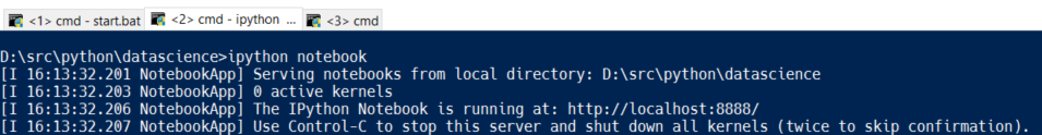
Running IPython
On the console type in: ipython notebook and you’ll see a web-server being started and automatically assigned an IP-Port. A new browser window will open and present you the content of directory IPython has been started from.
Console output
Jupyter Main Page
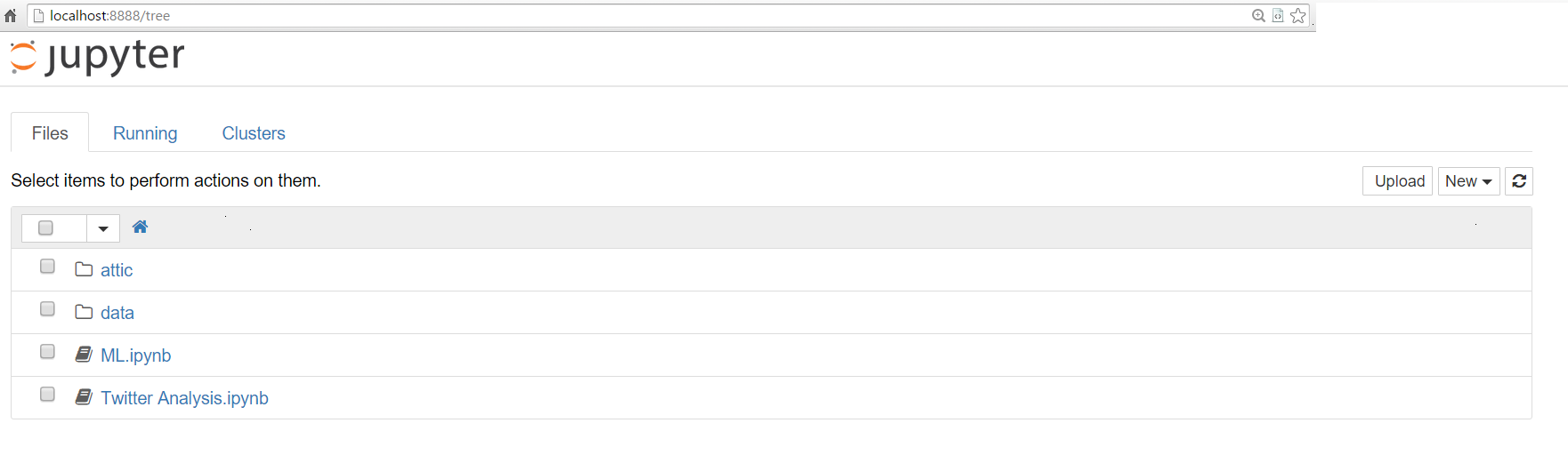
Via Browser you can load existing notebooks, upload them or create new ones by using the button on the right.
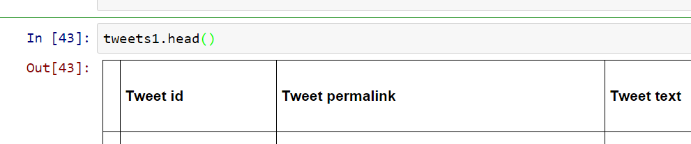
Of couse, you can load and manipulate many other file types but a typical workflow starts with a click on an ipynb-File. In this article I’m using my own twitter statistics for the last three months and the whole logic is in Twitter Analysis.ipynb
Using Twitter Statistics
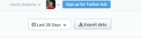
Twitter offers a statistics service for its users which makes it possible to download CSV-formatted data containing many interesting entries. Although it’s only possible to download entries with a maximum range of 28 days one can easily concatenate multiple CSV files via Pandas. But first, we have to look inside a typical notebook document and play with it for a while.
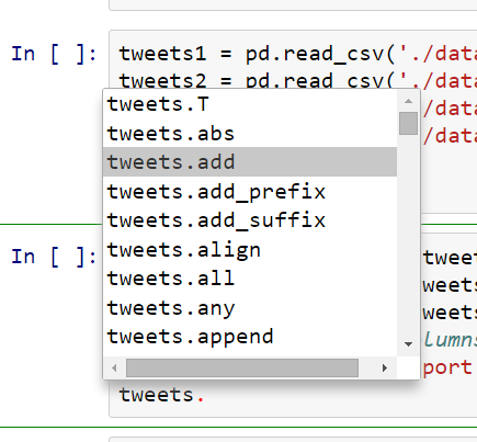
We see a window-like structure with menus but the most interesting part is the fact that a notebook acts like any other application window. By heavily utilizing the available browser / JavaScript-based technologies IPython notebooks offer powerful functionalities like immediate execution of code (just type SHIFT+Enter), creating new edit fields (type B for “below” or A for “append”), deleting them (by typing two times D) and many other options described in the help menu. The gray area from the above screenshot is basically an editor like IDLE and can accept any command or even Markdown (just change the option “Code” to “Markdown”). And of course it supports code completion 😀
Pandas, Matplotlib and Seaborn
To describe Pandas one would need a few books. The same applies to Matplotlib and Seaborn. But because I’m writing an Article for Losers like me I feel no obligation to try to describe everything at once or in great detail. Instead, I’ll focus on a few very simple tasks which are part of any serious data analysis (however, this article is surely not a serious data analysis).
- Collecting Data
- Checking, Adjusting and Cleaning Data
- Data Analysis (in the broadest sense of the meaning)
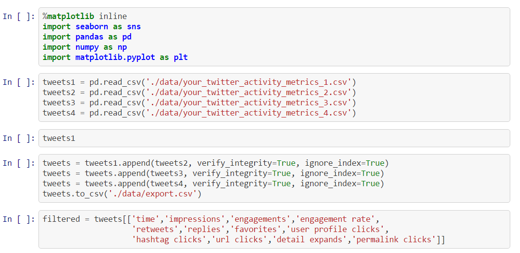
First we collect data by using the most primitive yet ubiquitous method: we download a few CSV-files containing monthly user data from Twitter Analytics.
We do this a few times for different ranges. Later we’ll concatenate them into one big Pandas’ DataFrame. But before doing this we have to load all the needed libraries. This is done in the first code area by using certain import statements. We import Pandas, Matplotlib and NumPy. The two special statements with % sign in front are so-called “magic commands”. In this case we instruct the environment to generate graphics inside the current window. Without these commands the generated graphics would be shown in a separate browser pop-up which can quickly become an annoyance.
As next we download the statistics data from Twitter. Afterwards, we instruct Pandas to load CSV-files by giving it their respective paths. The return values of these operations will be new DataFrame objects which resemble Excel-Sheets. A DataFrame comprises two array-like structures called Series. Technically DataFrame-Series are based on NumPy’s arrays which are known to be very fast. But for Losers like us this is (still) not that important. More important is the question: What to do next with all these DataFrames?
Well, lets take one of them just to present a few “standard moves” a Data Scientist implements when he/she touches some unknown data.
How many columns and rows are inside?
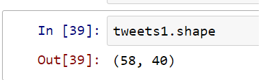
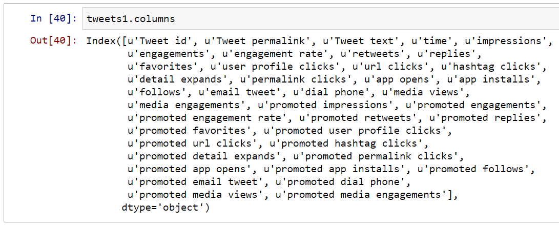
What are the column names?
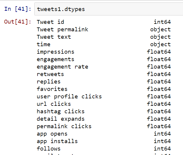
Which data types?
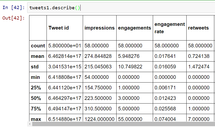
Let DataFrame describe itself by providing mean values, standard deviations etc.
It’s also recommended to use head() and tail() methods to read the first and last few entries. It serves the purpose of quickly checking if all data was properly transferred into memory. Often one can find some additional entries at the bottom of the file (just load any Excel file and you’ll know what I’m talking about).
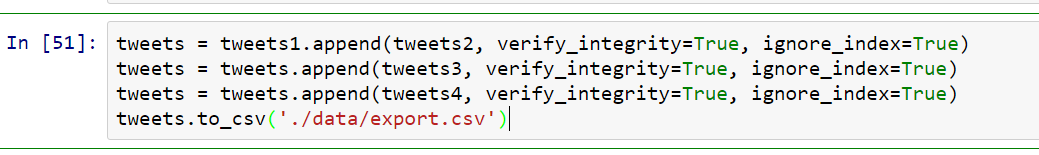
Concatenating Data for further processing
After having checked the data and learned a little bit about it we want to combine all the available DataFrames into one. This can be done easily by using the append() method. We’ll also export this concatenation to a new CSV-file. In future we don’t have to repeat the concatenation process again and again. We should notice the parameter ignore_index which instructs Pandas to ignore original index entries that is similar across different files that share the same structure. Without this option the concatenation process would fail. Also, we let check for any integrity errors.
Using only interesting parts
More data is better than less data? It depends. In our case we don’t need all the columns Twitter provides us. Therefore we decide to cut out a certain part which we’ll be using throughout the rest of this article.
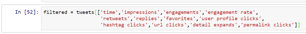
Here we slice the DataFrame by giving it an array of column names. The returned value is a new DataFrame containing only columns with corresponding names.
Adjusting and cleaning data
Often, data is not in the expected format. In our case we have the important column named “time” which represents time values but not the way Pandas wants it. The time zone flag “Z” is missing and instead we have a weird “+0000” value appended to each time entry. We now have to clean up our data.

Here we use list comprehensions to iterate over time-entries and replace parts of their contents from “ +0000” to “Z“. Later, we change the data type for all rows under the column “time” to type “datetime[ns]“. In both cases we use slicing features of the Pandas library. In the first command we use the loc() method to select rows/columns by using labels. There’s also an alternative way of selecting via indices by using iloc(). In both statements we select all rows by using the colon operator without giving any begin- and end ranges.
Filtering data
So, our data is now clean and formatted the way we wanted it to be before doing any analysis. Next, we select data according to our criteria (or from our customers, pointy-haired bosses etc.)
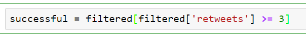
Here we’re interested in tweets with at least three retweets. Such tweets we do consider “successful”. Of course, the meaning of something can lead to an endless discussion and the adjective “successful” serves only as an example on how complex and multi-layered an analysis task can become. Very often your customers, bosses, colleagues etc. will approach you with sublime questions you first have to distill and “sharpen” before doing any serious work.
This seemingly simple statement shows one of the powerful Pandas features. We can select data directly in the index field by providing equations or even boolean algebra. The result of the operation would be a new DataFrame with complete rows containing (not only) the field “retweets” with values greater than or equal to 3. It’s like using SELECT * FROM Tweets WHERE retweet >= 3
Visualizing data with Seaborn
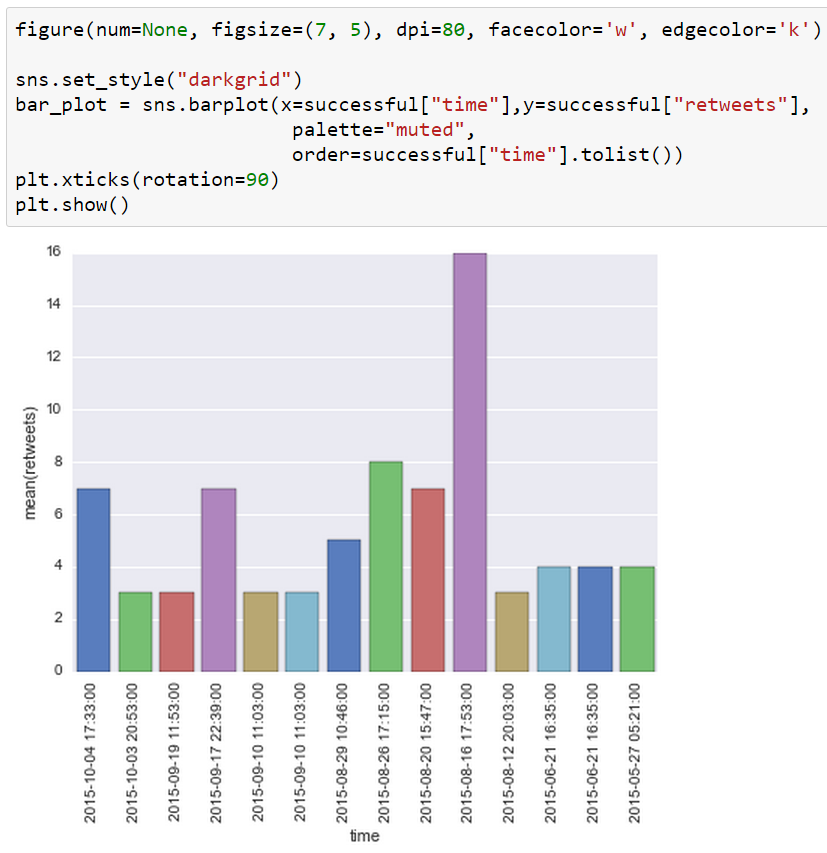
Finally, we want to visualize our analysis results. There are many available libraries for plotting data points. In this case we’re using the Seaborn package which itself utilizes Matplotlib. Further we will create an alternative graph by using Matplotlib only. Our current graph should visualize the distribution of our successful tweets over time. For this we use a Seaborn-generated Bar-Plot which expects values for X and Y axes. Additionally, we rotate the time values on the X-axis to 90 degrees. Finally, we plot the bar chart. Depending on your resolution a slight modification of the figure properties could be needed.
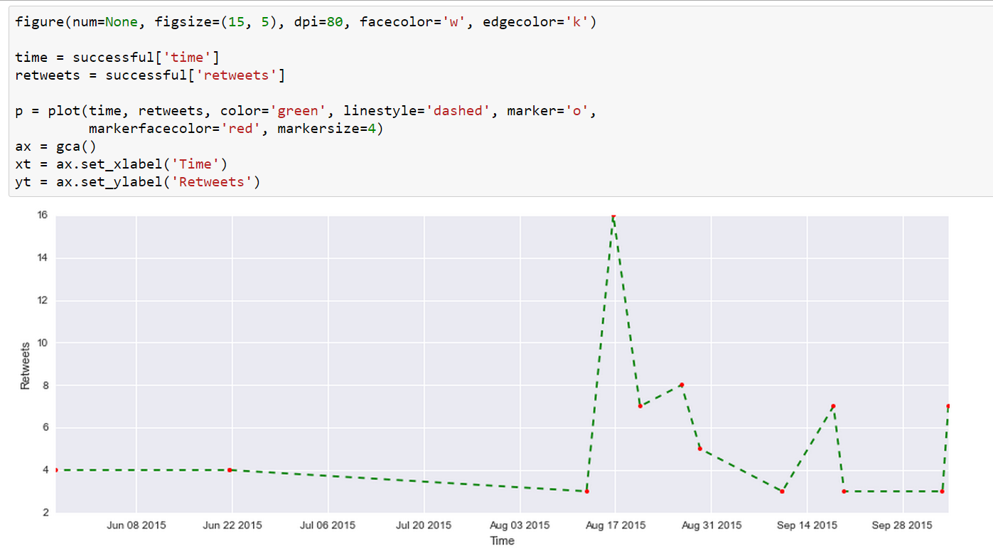
Visualizing data with Matplotlib
Here we use Matplotlib directly by providing it two Pandas Series: time and retweets. The result is a dashed line graph. Of course, there are so many different options within Matplotlib’s powerful methods and this graph is just a very simple example.


9 thoughts on “Data Science for Losers”
Wow. I came across this post via a random Google search and it’s very informative. Thank you for this. I will be reading it again tomorrow morning but I’m sure this will help my exploratory steps with data science using Python and the Anaconda distribution.
Hi Geoffrey,
Glad to hear that. Data Science is a broad path, full of holes. 😉
I’m thinking about writing a follow up article presenting a few more goodies, commands, scripts etc.
Regards,
Harris
Hi Harris,
Very nice entry. I have just come across your entry and I am like it a lot. Looking forward to keep reading new entries on the topic. Keep going like this.
Best regards,
suomi
Hi suomi,
Thanks for the kudos. Currently I’m thinking about including Apache Spark and Scala. Not sure how to compose it but the 3rd Article would be dedicated to “backend” technologies and how to access them via IPython.
Regards,
Harris
Nice article! Feel free to delete this comment as I only suggest a few typo corrections:
1) “DataFrame comprises of two array-like” should be “DataFrame comprises two array-like”
2) “Of course, the meaning of something can lean do an endless discussion” should be “Of course, the meaning of something can lead to an endless discussion”
Hi Jonathan,
Many, many thanks for the corrections. I’ll not delete your comment because you helped me to improve the article. 🙂
Regards,
Harris
This is good stuff. Bravo. I like your approach to write the blog. I don’t know Python but I have done a bit of Scala. I will keep following your blog to see if I can try similar stuff with Scala, for my learning.
Why do you insert both:
%pylab inline
and
%matplotlib inline
??
The first one is not necessary. More than one year %matplotlib inline replaced %pylab inline (which is deprecated) https://mail.scipy.org/pipermail/ipython-dev/2014-March/013411.html
Hi empet,
Yes, you’re right.
The magic matplotlib command already inserts everything.
I was just too lazy to replace the screenshot.
Now updated 🙂
Regards,
Harris